

Wednesday, September 30, 2009
Vis. Lang: Mindmap to help with ideas
For the first part of this project I had no problem finding the influence with Studio Dumbar's poster, but my mind kept on going back to the body figure of a dancer and not coming up with something new. So I decided to build a mind map to help me expand my iterations and start allover with these ideas. Hopefully this next round will be better.

Narrative in Sound: Storyboard for Kentic Type
So for my storyboard, I decided to start by doing everything analog by getting actual paper towel and drawing out the typeface I wanted with I went off of Clarendon typeface. From there I cut out the form and colored it in with a brown marker, so went I got to the scene of soaking, you actually got to see the color spreading throughout the page. I thought I should end my animation by wiping itself away, so it could start all over again smoothly. I choose to go with stop motion movement, so the activity of the piece(noun) representing the verbs wouldn't be in a chaotic mess. This also determined that I making my object constant across the whole animation feel like there is an unity of the three verbs. I'm still deciding how I am going to represent the previous animation before into this one, but I'll soon figure out a good way.


Type: Cover choices and decisions
THIS ONE IS THE ONE I'M GOING WITH!
This idea came to me besides the fact that I like texture of wood but the pattern that this image gave portrays the grid like structure I am using through out my layout design, as well as mimic a matrix system. And out of my goofy mind It would fit with most of the poems relations just by the ones I choose to do. Overall I have a few changes to do, but so far I'm very pleased with the outcome so far.


This image I choose for the reason of playing with the counters of a button, but not actually using buttons, as well as having a very complex image with a simplistic design that is yet complex too.
Monday, September 28, 2009
Vis. Lang: Sketches for Modes of Appeal
The sketches for logos. I tried to incorporate a map and some more of my ideas would include some diagrams that would have some call outs, maybe.


Sketches towards the ethos path. Hopefully I have gotten the idea.


Sketches towards the ethos path. Hopefully I have gotten the idea.


Saturday, September 26, 2009
Narrative in Sound: Sketches and Idea Approach
This is the main approach I want to take my animation with. My idea towards each verb are different where I'm going to use analog mainly. One way for wipe I was thinking of using a dry erase board, then for soak i was thinking of actually cutting out the word in a towel and showing the effect of the water soaking in/expanding, and then last but least with the soaked towel, I was going to show the twist of the word by the same object and then slowly the text shrinking to dry out(per say). With the flash of the my first animation I didn't want it to interrupt with this new project, but also I wanted it to support it over all, so if I have to I might end up having a few more frames towards the twist and soaking stages of the animation to represent the previous animation made.

Here are the 10 different ideas towards each verb (wipe, soak, and twist)


Here are the 10 different ideas towards each verb (wipe, soak, and twist)


Thursday, September 24, 2009
Vis. Lang: Images for Project 2: Modes of Appeal


Studio Dumbar, poster for Holland Dance Festival, 1995 *poster series
Gert Dumbar founded Studio Dumbar in 1977, which was first located in the Hague, but now is in Rotterdam. The studio has a comprehensive range from experimental graphics for cultural clients to corporate identity programs. Dumbar rejects "dehumanized forms" and advocates graphic design with "stylistic durability to survive beyond its time." Dumbar values the role of humor and impulse in design and believes an element of fun and play should spread throughout visual communications whenever appropriate. He also believes in teamwork and dialogue are key within the studio's process, and encourages individual approaches.
Within this poster, it makes a conscious effort to produce innovative and provocative graphics with the goal to achieve the level of freedom and diverse techniques usually associated with the fine arts. The intended audience, I think, would have the interest in the fine arts, dance, and anyone captivated from the poster. The communication goals of the context is along the lines of Pathos since this poster is persuading the audience to see emotion through movement. The context that it is viewed in would be placed in the major parts of town where people are able to gather around and enjoy the entertainment.
The Holland Dance Festival has a great history for this year will be the 50th anniversary, which most of the performances happen go on at the Nederlands Dans Theater . The Nederlands Dans Theater evolved into one of the worlds leading and innovative companies of modern dance. Therefore, fifty years of the Nederlands Dans Theater cannot easily be forgotten. The Nederlands Dans Theater and the Holland Dance Festival share a long history and find strength in this connection to celebrate Dance as never before in Dancing capital of the Netherlands: The Hague. The Holland Dance Festival lasts up to three weeks, where it invites dance companies and dance artists all over the world to be on stage.
Wednesday, September 23, 2009


Monday, September 21, 2009
Vis. Lang: Final Rhetoric Poster
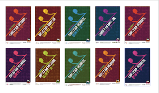
So I wanted to express Christian McBride as one of the best bass players, so I made a visual pun using the 16th rest note and the tagline "above the rest."

Through out this whole project, it brought me back to another form of classic music in a different genre. My intentions for this poster came to me by coming up with different ideas to represent Christian McBride's music as well as the audience that would be coming to the event. The colors I choose started with more warm colors, but then through out the process I realized I needed to add some more jazz feel colors to make it pop a little off the page, as well have different levels of read. The background I kept settle so that the initial read for the driver's is the main information, where as the everyday walker can enjoy the different views and see the details of the design.

Through out this whole project, it brought me back to another form of classic music in a different genre. My intentions for this poster came to me by coming up with different ideas to represent Christian McBride's music as well as the audience that would be coming to the event. The colors I choose started with more warm colors, but then through out the process I realized I needed to add some more jazz feel colors to make it pop a little off the page, as well have different levels of read. The background I kept settle so that the initial read for the driver's is the main information, where as the everyday walker can enjoy the different views and see the details of the design.
Friday, September 18, 2009

Thursday, September 17, 2009
Vis. Lang: Poster and Exploration
This what I have as an idea of my poster, but also included some color exploration to see what could make it even more jazzy. Hopefully this will help in the end.


Narrative in Sound: Nouns and verbs
So through this beginning process(stage) I decided to explore some of the possibilities I could have with painting a picture, so I have a list of nouns with verbs but also a sub category. the list goes:
Noun:Verbs
Sub verbs
paint: blend, compose, squezze
collide, design, splash
brush: drip, crawl, gesture
scrape, stroke, swipe
water: soak, pour, drip
dribble, splash, spin(b/c of cleaning a brush)
paper towel: wipe, dry, twist
soak up, rip
pencil: sketch, scribble, layer
draft, undo
Noun:Verbs
Sub verbs
paint: blend, compose, squezze
collide, design, splash
brush: drip, crawl, gesture
scrape, stroke, swipe
water: soak, pour, drip
dribble, splash, spin(b/c of cleaning a brush)
paper towel: wipe, dry, twist
soak up, rip
pencil: sketch, scribble, layer
draft, undo
Type: Final Thoughts
With this project, The Mailer, I've done a lot of thinking to come up with a concept. Also while doing a design that read well, as well as represent the typeface. My thought process of approaching this typeface was how the creator, Robert Slimbach, had the idea of making the type seem like the Renaissance era with a modern twist involved, so I did an approach where I made the setting of Minion to the Renaissance era and adding a modern twist to how their papers or books looked like back then. I kept to my two adjectives that I pulled from a list that I thought represented the typeface, which was dramatic and tradition with a modern flare.
Keeping the tradition, I showed the capabilities of the typeface as a book font in some places as well as working on a grid system to show how well the typeface was capable of dealing with space, since my research showed how Minion was created to fit more texts and save money that you spent on space.
Overall my concept was making something that derived from a old type idea to a new idea with an old twist. Meaning the idea of the parchment paper as the background, as well as an initial that started the piece that gave the idea of a illuminated book feel by also adding a dramatic kick with the big parentheses as an example.
Narrative in Sound: Final thoughts
When I was planning out how I wanted the perception(view) to be straight forward for the 1st person animation, as for the third person the point of view is of observing the artist at work. The conveying of movement from frame to frame where either portraying moment to moment, scene to scene to give the ability of how a painting is done. Also the timing of frames gave the sense of the actual speed in life on how fast someone can put paint on a palette for example. The medium of color pencil was chosen at the beginning for the contrasting of the 2 mediums already going to be used. This also helped with blocking out extra information, but I guess in the end I should have kept the backgrounds both white to give a better viewing and combining situation after going through the critique on Wednesday. Overall the learning experience of dealing with time, two different point of views, and just the process to get to an animation took some time, but I'm still please with what I turned in.
Wednesday, September 16, 2009
Narrative in Sound: Final animations
1st person revised: painting a picture from Jessica Meurer on Vimeo.
first person pov ^
3rd person revised : painting a picture from Jessica Meurer on Vimeo.
3rd person pov ^
Combined 1st and 3rd person pov from Jessica Meurer on Vimeo.
combined 1st and 3rd pov ^
Monday, September 14, 2009
Type: Inside
Here is the inside with the guides showing where I was positioning my text on the page.


Type: Actual Outside before tweaks
This my actual idea finally for the outside part to get to the inside, which will have more of a traditional look which is going to be the glue to which I got my idea from.


Sunday, September 13, 2009
Type: Update of outside finally
And believe me these are not going to be my outside at all...my idea has changed to something I think has more drama and tradition to it.


Vis. Lang: Process of Posters Put out

 So my 5 posters that I went further on is the rest. I ended up using Tammy idea of the 'Above the Rest' after a 5 hour talk with a group of people that it would be the best representation of Christian McBride. As I was going through this process of my type and layout, I decided it looked flat so I added a settle pattern in the background for dimension. I'm still thinking in the long run if I'm able I want to create the actual rest or even doing something different. I'm up for any ideas, but I'm happy so far where the type is going.
Vis. Lang: Music I want to Share!!!
So this Ian Cooke, I saw him play last year and that's when I fell in love with the different sounds that a cello can play.
And then last night went to go see Buckethead and the opener who is a guy that plays a tuba, he's style of repeated certain parts is simular to what Ian Cooke does, so I was excited to see another person doing it with a different instrument.
And then last night went to go see Buckethead and the opener who is a guy that plays a tuba, he's style of repeated certain parts is simular to what Ian Cooke does, so I was excited to see another person doing it with a different instrument.
Friday, September 11, 2009


Thursday, September 10, 2009


Wednesday, September 9, 2009
Narrative in Sound: Storyboards
For both of my storyboards, the process I used went back to the basics of actually doing a painting (ha of course)for the sense of preparing, to doing, to finishing, and then finally to details of the painting. Through this project, I'm lucky enough to kill 2 projects with one stone meaning for studio, but also for my brother, so both personal reasons.
The next step after photographing each process was then draw each frame out in a 2 x 3 box, then finishing by coloring with color pencil. During the coloring process, I will say my hand did cramp up, but it was totally worth it.
Reasoning behind choosing color pencil over some other ideas was because it gave me the chance to work in 2 mediums. One being painting , which is wet and takes time to dry where color pencil has no dry time and you can layer as much as you want. I also felt with color pencil, I could block out non-important things and making the main focus pop from the frame where with a different medium like photography it would show the non-important things.


Monday, September 7, 2009
Type: Minion Mailer Update!
Here is an update for my inside of my mailer. So far I think it is better than before, but still have some work to make the type face shine even more. The idea of the older paper as the image was to give the illusion of being back in the Renaissance. Then by that I came to a conclusion to use brown, orange, and green will be my main colors to exert keywords or want to point out a theme. The main theme will be on the opening parts of the mailer that I'll be working on next and will soon enough be up.


Friday, September 4, 2009
Vis. Lang: Matix UP close and personal
So for the past week some of the things I've been thinking of is the bass......not a fish or the music coming from car or home theater, but an actual upright bass. I came up with some ideas for the bass like for my puns one of them I did use speakers for a little underlying information about my artist, Christian McBride, since he does play electric bass too.

I am refining this idea more, so maybe it might get used. We will see. Another idea was using the bass clef for a main aspect of the bass being played in that manner as well as typographic relevance.

Another idea I had that was a pun was using the tool of classical training of time as the basic idea of a bass too. The swinging arm that either goes faster or slower by the weight resembles as a bow that is used to play a bass.

For some reason I wanted to show my music knowledge of using a rest and a repeat symbol that is used in writing music as a way to show an abstract form of the handle.


I also played on the form of the outer body of the bass too that can play with typographic form to give a simile. And also a parody of the crayon to announce the groups music cd 'Kind of Brown', it also might draw in more of the older youth to come and listen to music.


Subscribe to:
Posts (Atom)