From the beginning, I originally was working with the question, ‘ how can a pre-existing typeface be manipulated to fit into a specified grid?’ I began with using book fonts because I felt like the fonts (Helvetica and Bodoni) would give me a better understanding of the characters between thick and thin lines, and serifs and sans serifs. I decided to start off with the traditional grid and work towards the complex, which made me realized I need to have a rule of how I would fill in the shapes. The rule was if the letter form was contained within the shape, it would get filled.
Through this beginning stage, I figured to have seven steps to see the progression from geometric to more organic forms, which is something I learned about with the more complex the grid the more the letter form would become more organic or still contain the original attributes with small changes.
Continuing, I decided to work with display fonts to see if there would be a difference with clarity. I also wanted to see if it was also true with the size of the font. This would answer the possibly if the letter form becomes abstracted.
This experiment confirmed the likeness from before, which I learned the forms change by the size and become more clear to where the smaller forms became illegible. On the other hand Cooper Black was the only font that pushed the legibility in each grid, which was learning experience with its thick form.
I tried some experiments with color overlays to represent the levels of different grids and how the typefaces reacted, but I personally think it didn’t go well. I also determined that cooper black would be the best to carry out the rest of my experiment and revise my question to, ‘ how can a pre-existing typeface be manipulated to fit into a specified grid and make the manipulation into something new?’
What I learn from putting the manipulated typeface into a grid was no matter what I tried it only was clear in the simple grids compared to the complex.
It was at this put in which discovery that cooper black was a great decision to go forth in because by putting it into a new grid it got a new personality in a triangular grid, which manipulated the font into a Gothic black lettering. This is when I decided that I would work with the grid and break my rule a bit, so I can get the letter forms of the manipulated font to look like it was a family.
In the process of making a typeface family I learned that there are many ways of creating a letter form and it comes down to the similarities as a whole. This process took a lot deciding on what could work, but finding out there were many ways to get to this point was a new experience.
I feel over all that legibility was key in my project, which tended to get broken by each step I experience. I also feel that I learn quite a bit on separation (where the type could work by itself) and fragmentation (where the initial forms got disrupted) on how the typography plays as a whole. Through this I feel I have a better understanding that type can be manipulated in so many ways, either by hand and by using a grid. I still want to explore.

Sunday, February 28, 2010
Saturday, February 27, 2010
Type: Process of Cooper black
 A nice way of showing the many different ways of approaching a typeface. In this case, I was surprised that some of the letters could take on many different states where some only could take on one form. Still very surprising.
Thursday, February 25, 2010
Info. Arch.: Working.....
So after having multiple critiques end badly, I really feel like I am behind. I felt like I needed to figure out the functionally first before doing the major major design that I like to do, but I guess I need to take a step back and design something I like and work from there. So far right now I feel like what I have here reminds me of a old school museum like website just by the colors. I have tried pastels, and these colors and I don't think bright bright colors would work either. I will post the old versions with the pastel colors asap, so keep a look out. SO much to do in SO little TIME.


Tuesday, February 23, 2010
Info. Arch.: From Presentation
Sorry for the delay, but here are my three approaches, and while thinking it over I have going to look at approach 1 and 3 to refine even further.
Approach number 1: dealing with sliding out time lines that present a reading. The time lines also have stripes that reveal information like a photo or important information.


 Approach number 2: Has the same concept as the first one but instead of opening up the time line to reveal the more information, this approach gives the person the choice to choose between the two designers and still look through the time line. This approach however does lack the ability to let the viewer read about modernism and post modernism in depth.

 Approach number 3: With the idea of Katherine McCoy's understanding communication, I played with her idea of how all four connect in some way. The viewer is able to click on any on the titles to get the readings and images will reveal through out. This approach needs some major revisions to get where it would be interactive more.
I was thinking if I do revise this one I could have images in the background in which when clicked on the subject they would become highlighted, and while they are highlight then the user could click on them to in large and read what they are. A lot of work here to do.

Approach number 1: dealing with sliding out time lines that present a reading. The time lines also have stripes that reveal information like a photo or important information.


 Approach number 2: Has the same concept as the first one but instead of opening up the time line to reveal the more information, this approach gives the person the choice to choose between the two designers and still look through the time line. This approach however does lack the ability to let the viewer read about modernism and post modernism in depth.
 Approach number 3: With the idea of Katherine McCoy's understanding communication, I played with her idea of how all four connect in some way. The viewer is able to click on any on the titles to get the readings and images will reveal through out. This approach needs some major revisions to get where it would be interactive more.
I was thinking if I do revise this one I could have images in the background in which when clicked on the subject they would become highlighted, and while they are highlight then the user could click on them to in large and read what they are. A lot of work here to do.


Monday, February 22, 2010
Type: Black lettering reaction
So playing with cooper black is actually fun and interesting to see its funny reaction to some new grids. But before I go into what found interesting with the new grids, I decided to go back and edit the cooper black black lettering to clean it up. With that clean up, I have decided to do a family of typefaces for cooper black but by using new grids. I am going to make an alphabet using cooper black black lettering as my base, then from there see how that font reacts or is manipulated into the new grids which will make a new family for that font. I have learned that even though a grid is geometric, you can still get an organic letter form even if the legibly is faded, the grids give character.


User Ex.: Project Brief: The Persuasive Experience
Scenario
Natural Order Wellness (now), a long time supplier of ingredients for natural wellness, health and beauty products is entering a cooperative venture with several investors to develop and market products of its own. Some potential products include, fortified water, soda/cola, vitamins, diet supplements, household cleaners, beauty or other personal care items marketed under the brand name ACME. They are interested in selling these products on multiple networks, and these products need to be earth-friendly.
Initial Observations
I feel like most of the items that are being used and sold to today are going towards women, but there are a few men that cook as well. I have noticed that most of the baking products haven't really changed their design in a long time, and I have even think that the designs are too quiet because I have even walked by the products missing where they are. I feel like when these products are bought, the user either puts the product into another container or they were stocking up on the item, in other words my question has come to, how can I make a product stand out and will also function as a container after the product is bought? I want the user to enjoy the package, so that won't just throw the casing away but keep it as part of a new generation to come.
Target User
The target user that I'm trying to get to buy this product are women aging between 18- up. I am starting at the age 18 because the girls start to be on there own in college and start shopping for themselves, but I'm also wanting to keep the usual women in the factor, since they usually look for what is the best out there in product wise. I also wouldn't mind targeting men starting at 21 and up because I feel like men don't really bake as much, but there are some that have a passion in cooking. Overall working with both women and men will help open their eyes to something new.
Proposed Strategy
I am going to propose this new line of products to women and men through the actual grocery store and possibility giving the products its own table for displaying purposes since it will be new, it will need to be introduced to the public (it will remind you of Sam's Club or Costco).The idea of the product being presented in a displayable way will persuade the user to purchase the product.
In this displaying manner, the user will be able to see the product and hear more information about the product before they buy the product. This will give the product the opportunity to be showcased and be introduced.
Product Line
My proposed product is going to be a set of natural flour, brown sugar, sugar, and salt that will be in casing that will 'showcase' the product. I want to look at what is out there already and make it better. I also want to see how the product looks when it is on the wall with more than one product at hand. I am also thinking of different sizes for amounts that can or could be used. I would like to make the user feel like they are getting something new and learn something new, so I am thinking of adding something special to the larger qualities of the product. The sizes I was thinking for each of these will consist of packets, equivalent to cups, and as well pounds. Giving these different sizes will help with the competition that is already out there, like Old Mill, Splenda, and Morton.
I want this line to be long-lasting with the capability to be used and not put into another container. I also hope that 'showcasing' the product will help give the user the right connotations so they will want to buy the product.
Friday, February 19, 2010
Type: How do you feel about cooper black black lettering?
oooo the wonders of getting to this put is so much fun....the next steps may involve color layering or using one of the already manipulated typefaces and put that into a new grid... this shall be interesting to see the results. Also editing some of the maniulated typefaces will seem easy to figure out, but I bet there are more complicated ways to approaching the edit. WE SHALL SEE!

Cooper Black black lettering below:
 8x8 grid
 4x4 grid: Got to love the simplicity o the form. It's amazing to see what you can get.
 Trying to figure out what would be the best approach to using layers and colors.


Cooper Black black lettering below:
 8x8 grid
 4x4 grid: Got to love the simplicity o the form. It's amazing to see what you can get.
 Trying to figure out what would be the best approach to using layers and colors.
Wednesday, February 17, 2010

Monday, February 15, 2010
Type: Comments given through crit. with reflections
-This is very conservative.... I'd like to see you really push it.
-The more complex grids and way more interesting, they have a lot more dimension and pushing towards meaning.
-The more unusual the grid, the more interesting the result. script- good. fat grid- good. angles grid- good.
-Could the transformation be seen in motion?
To answer this I would have to say it could, but it isn't the direction I'm thinking of.
-Since these are built in grids, try building some words to see if they fit within each other.
To reflect to this I plan on doing so, but I need to get further in the steps of forms to start layering them I feel.
-How is this anything more than pix elating type? Are your grid choice making more interesting letterforms?
It is pixelating the type but the different grids are manipulating the letterforms so it can conform to it. This process is just the beginning, who knows if these may actually work really small and how they compare to how the computer pixelates the forms. I also plan on possibly adding more different grids just to see other reactions, but I'm not for sure yet.
-I like how many solutions you're looking at. The universal options of each letter looked hard to do.
-I like seeing the handwriting into bitmap. Its actually interesting as raw grid and marker. Brainstorm- Do it backwards whatever its a really good place to be at since there is a real good foundation. Now you can deconstruct.
Plan on in someway
-I like that its starting to look like Tessellation.
-Good idea- the script fonts seem to be more interesting though.
-This one's my favorite. I feel like these are turning into abstract letterforms that can only be read in context.
-The square script is interesting and nice! Starting to "shape up" haha
-Aren't all typefaces based on a grid/ structures, like x-height and so on. I'd like it to break the flat plane it's in.
I plan on using color sooner or later to break the flat plane, but it will be difficult to do right now.
-The typefaces that interest me the most are the ones that push legibility and/or are only understandable in the context of other letters.
Totally agree with this...I want to explore this a bit more.
-!great
-The abstract nature of this is very interesting. Push the grid in this respect, it could be pretty awesome!
-I think you've answered your question.
In my mind, I don't I have yet because my question is very limited to what I have an idea towards. I'm thinking of another question along this one that can become more broad, and hopefully it will make sense.
-I like the changing and how different they become.
-Use non-linear grids.
I am and I think person didn't realize there were multiple grids behind one another, but oh well.
Overall I do feel like my question is to narrow for the way I am thinking in terms of going towards. Hopefully I can fix that. Some these comments helped me in certain areas of narrowing into, but I still like I have a lot to do still.
Sunday, February 14, 2010
Type: Experimental type so far
The question that I went with is "How can a pre-existing typeface be manipulated to fit into a specified grid?"
Through the process of experimenting I came along the lines of dealing with sans serif and serif fonts such as Helvetica and Bodoni. Through the use of grids I broaden the idea of what type of grids I would use. For the first grid I used the general 4 x 4 grid that you can get at any store for math classes. Before I even started filling in the grid, I made a rule of filling only the squares or shapes of what the original letter form falls into it.
 By the second step, I kept with the general grid, but decided to go with a smaller grid to see how the shapes would react in this 8 x 8 grid.
 Step 3 consisting of another simplistic grid that can be used in many different ways, like in a layout or in this case forming to a grid. Through this step, the clarity of each font isn't shown because some of the forms could get confused with another letter.
 Step 4 of answering the question, I decided to go into a different direction rather than just squares which most bitmap fonts are formed off of. It was this step that I realized that the Bodoni font became to give a gothic, black letter form. To me it was surprising on how both reacted differently and only Bodoni came out nicer than the other.
 By step 5, the gird I choose dealt with a star formation, in which no matter what I did give each font the connotation of spiking or the stay away feel. This grid is probably my least favorite, so I might choose a different grid later to broaden on.
 Step 6 of the grid experiment was an adventure in that each letterform has it's own personality, that also kept a bit of the original structures like the serifs and some of the thin stokes.
 It was step 7 that I found a grid that gets as close to the original letterform, but it doesn't follow under the question because it does the least manipulation to the form.
 Through the first 7 steps I choose easy to use almost anywhere fonts. This next part of my experiment is to use fonts that can only be used for certain reasons and not in books like cooper black. I also decided to make the point size of the fonts bigger to see if there is a huge difference. The idea of changing the size of the font will help determine if the original steps taken will be close in the same fonts used before while still exploring the new font faces.


Saturday, February 13, 2010
Type: Weingart
In Salem Valley, Germany of 1941, a designer was born named Wolfgang Weingart. Weingart is well known internationally for his design and typography. In 1964, Weingart moved to Basel were he sat and begun to study typography and teach his ways of knowing to the students. Weingart retired in 2004 from teaching, but continues to teach summer programs through Basel. He is categorized a part of the Swiss typography, but he was the one to become first at breaking the grid as well be called “Swiss Punk”. Weingart is most famous for his experimental, expressive work that broke that grid that the Swiss are well known for.
It was when Weingart started teaching at Basel when people started to ask the question ‘what is Swiss typography?’ As designers, we know it is based off of grid systems, which helped with placing type and image on a page. Also the Swiss worked along with sanserif typefaces because it was a clear way of getting the message out there. Weingart on the other hand feels that his experimental typography is also Swiss because of the ‘natural progression’ from how we know the Swiss typography. Weingart explained that his experimental typography was grounded, which were on his understanding of semantic, syntactic, and pragmatic functions.
As we know it, Weingart’s inspirations were mainly drawn from his experience in the processes of typesetting and reproduction, where he is able to push the limits of the outcome. Weingart also believes in that all you need is four typefaces to any typographic problem. With his experimentations, it expanded over three different typesetting technologies. Weingart wasn’t so enthralled to the computer technology because he felt like it was too ‘illusive’. As AIGA would say, ‘Weingart is making the young generation nuts’.
Wikipedia
Archive
Keith Tam
AIGA
*more will be added asap
Tuesday, February 9, 2010


Friday, February 5, 2010
Type: Questions for exploration
1. How can different grids simplify original letterforms?*
2. How can a typographic grid become 3D?
3. How can multiple separate grids combined make something new?
4. How can color decipher dimensionality on 2D surface?
5. How can a pre-existing typeface be manipulated to fit into a specified grid?
6. How would a grid be created out of shapes besides squares?
7. How can the grid be used but still is hidden?
8. How can a grid give personality?*
9. How can math be used to create a typeface in a grid?*
10. How can a found object give relationship in a grid?*


Thursday, February 4, 2010
Type: Research
"write a page or so (not including images) about this recurring typographic tendency or larger trend you observe from your research. how would you describe it? what are its traits? where did it begin? where does it appear? who’s doing it? why is it important?"
Where I feel this typography had started was with bitmap fonts, which most bitmap fonts are made up of a modular form or grid base. In any case this typography was a driven form for the computer screen because each font was and still is made of pixels. As a person would need a larger font for the screen the pixels of the font would expand and alter to the form. It is amazing to see the difference of where computers started, when computers dealt with a limited storage space and slow speeds, and the process of analog was key for fonts because at the time it was too expensive to render some complex font. As a couple of decades pasting, the font would render fast because the prices of storage and speed came down.
As for how I would describe bitmap fonts, they are extremely fast and simple to render depending on the type of grid system being used. This simple render could become more complex with the simple of altering the simplistic grid form. I feel like it has been around for so long that there are times people forget the beginning of fonts and how they have been used and changed throughout time. Which gets to my next part of my research dealt with grid structures.
With the typographic grid, it has a two-dimensional structure made up of a series of vertical and horizontal axes. It is usually serves as a way for designers to organize image and text. Before the raise in movable type and printing, the grid was based off of optimal proportions for handwritten text on a page, it was also known as the ‘Villard diagram’ and used since he medieval times. As for the evolution of the modern grid, designers such as Emil Ruder and Josef Muller-Brockman questioned the conventions of a layout. They began to come up with a more flexible method to achieve coherency in organizing a layout.
The grid was very important for the Swiss in modernism because they embraced the grid structures with the use of white space as the active element in communication. There is one person that pushed the boundaries of the grid, which was Wolfgang Weingart. He pushed it to the manner of typography becoming more expressive. Weingart made his work seem like it was free but yet controlled in the manner that he embraced the experimental aspect.
Type: Week 2 Reading response
what do you think about technology's role in enabling typographic experimentation? what technology is the present-day equivalent to the desktop computer, and how might that be utilized in type design or typography?
The technology's role in enabling typographic experimentation has of course changed through out the years. I still hear the stories of there not being an undo short key, which makes me feel like we have to work harder to be more persistent. We may have the key to undo things, but sometimes I feel like we need to experience what some designers have gone through. If we didn't have the capability of having a computer, then maybe we would be looser in expressing the piece. One thing I'm happy I try to do is to sketch out my ideas more before getting glued to the screen, I feel as it keeps my mind open to many different possibilities instead get stuck one idea. And my brother and I always talk about how computers are not humans in the fact they don't compare to the human hand for the sensibility purpose. I feel the closest we can get to a desktop computer is to keep learning different methods they we can only do by hand, in which experimenting comes handy.
what potential exists for continuing to explore the "second order of denotation" as mentioned in the cranbrook/mccoy sections?
On page 14 it was explained that "to enhance the meaning while not abandoning the framework that unites the whole" would be another way to look at formats and conventions, but to me what does this all mean. Well to answer that I feel like it meant to think of different ways of explaining ideas, so having one word represent more ideas or feelings. I also think it means interactivity of viewers to a piece to get them to think and see if they understand. I also feel like McCoy's way of word play has given the spark of secondary levels of meaning.
further, what potential might your area of interest have to "promote multiple rather than fixed meanings" as jeffery keedy mentions? and what role might the reader play in the construction of your typographic messages?
I feel that the way I take my messages will have either an underling of meaning and the ability to make the viewer think of what the message is. I really want to figure out multiple ways of representing a grid based type and the grid. I think the role of the viewer would be a variable on whether it is understandable, but I'm hoping in one way to figure out how to make this project interactive, so the viewer themselves learn what I learned.
Info. Arch.: Tight Wireframes
Tight idea 1:
*have a timeline running across the top of the screen where you can click on the lines throughout to see a fact or image.
*then you have the choice of clicking on massimo or mccoy's names to get their story with options of viewing images throughout

 Tight idea 2:
*have a more realistic timeline of when things happened
*for the choice of massimo or mccoy, you can have expandable options like: story, bio, and gallery
 Tight idea 3:
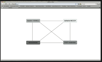
* idea to show connection between all four (mod., post-mod., massimo, mccoy)
* click on one of the boxes and it puts a overcast over the rest of the screen highlighting what your looking at and to get out of that it by clicking the same box you clicked the first time


*have a timeline running across the top of the screen where you can click on the lines throughout to see a fact or image.
*then you have the choice of clicking on massimo or mccoy's names to get their story with options of viewing images throughout

 Tight idea 2:
*have a more realistic timeline of when things happened
*for the choice of massimo or mccoy, you can have expandable options like: story, bio, and gallery
 Tight idea 3:
* idea to show connection between all four (mod., post-mod., massimo, mccoy)
* click on one of the boxes and it puts a overcast over the rest of the screen highlighting what your looking at and to get out of that it by clicking the same box you clicked the first time


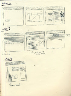
Info. Arch.: Drawn wireframes
Here are my rough sketches of my wireframes. At the beginning I was thinking of different ways to approach the stories and then on the later wireframes, I tried to combine both a time line and the stories. So now I have to choose 3 that would work best, we will see in the next post. :)


Tuesday, February 2, 2010
Info. Arch.: Find And Share
BAR GRAPH
http://awesome.good.is/transparency/web/0911/working-out-on-the-way-to-work/flash.html
http://awesome.good.is/transparency/web/0905/trans0509whoiscomingtoamerica.html
PIE CHART
http://awesome.good.is/transparency/web/0911/globalemissions/flash.html
TIMELINE
http://www.good.is/post/transparency-where-are-all-the-fish/
REPRESENTATiON DIAGRAM
http://www.good.is/post/buying-a-brand/
Monday, February 1, 2010
A little research
So with a little research, I learned that the area I want to dabble into is something that we have tried before, which started with bit-mapping. I want to give my approach a deeper meaning. This means I'm looking at modular typefaces and the way they can be placed. I found that modularity was key in my research, but I focused more of those that reinforced the grid or broke the grid in one way. The influences I looked at for staying within the grid was Josef Muller Brockmann, Emil Ruder, Jan Tischold, and the contributors of the book Making and Breaking the Grid By Tim Samara. Along with the book, I looked at Wolfgang Weingart as the influence of breaking the grid.
Some of the research I dabbled in a bit is by looking at artist that have either bold content or form. I was looking at Rick Valicenti, Elliot Earls, and Woody Pirtle for the intention to broaden my visual intentions for a viewer. One of things that I learned by these three is underlying meaning to visual, meaning you can have all the information on a page but it can be an abstract idea. So these influences will help on how I want to showcase my experiment study.
Some of the areas I'm interested in are:
Type that will be interested by the eye
Taking a different approach of breaking down a typeface to the core in multiple grids that are modular in 2D
Different approach on method of taking
Show that type on a flat plane can be 3D by color
Try to make my message engaging to a viewer that is visual by the type
Figure out if there is a scientific approach to making type from a grid, asking the question "what is the specific point that is similar in this typeface, and what does it take to keep the point in the same place, if possible?"
Subscribe to:
Posts (Atom)