Wednesday, November 12, 2008

a good find


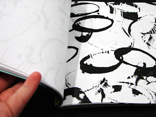
So I've been hearing a lot of things from the junior class about their type class and how they are study interior space with type. This image I thought would give a well image of scale with letters. And this image below I thought it would give another sense of space and scale.

Tuesday, November 11, 2008

my book for mark making


My concept of how my book would really look like not made of black matte broad. I would like to say that the dividers are yellow to separate the lines, and the outer cover is something I'm very pleased to come out this way. There may be some additional things to add like the poem I was referring to, so we'll see.

Friday, November 7, 2008

More...


My final Typography layouts for the element krypton. These were fun.

yay for layouts


So I have decided that I want to explore page layouts, so with my color book I decided to put a little touch on the start. I used perpetua font in many different sizes and weights. I also played with how the titles of each page would fit together as a whole, and I think it turned out to my liking.

Wednesday, November 5, 2008

Pros and Cons of Vector and Bitmap

The Pros for vector: (this is what I'll be using)
*made up of points, lines, and curves
*mathematical creations
*no losing of quality
*ideal for multimedia

The CON: * lose of handmade look

The Pros for bitmap:
*deal with pixels
*ideal for photographic images

The CONS:
*can't produce to higher level
*blurriness