Monday, December 1, 2008

A,B,C


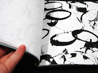
This image, I thought was intelligent with the use of books. This reminds me of the bitmap project we had finished a week or so ago.

Wednesday, November 12, 2008

a good find


So I've been hearing a lot of things from the junior class about their type class and how they are study interior space with type. This image I thought would give a well image of scale with letters. And this image below I thought it would give another sense of space and scale.

Tuesday, November 11, 2008

my book for mark making


My concept of how my book would really look like not made of black matte broad. I would like to say that the dividers are yellow to separate the lines, and the outer cover is something I'm very pleased to come out this way. There may be some additional things to add like the poem I was referring to, so we'll see.

Friday, November 7, 2008

More...


My final Typography layouts for the element krypton. These were fun.

yay for layouts


So I have decided that I want to explore page layouts, so with my color book I decided to put a little touch on the start. I used perpetua font in many different sizes and weights. I also played with how the titles of each page would fit together as a whole, and I think it turned out to my liking.

Wednesday, November 5, 2008

Pros and Cons of Vector and Bitmap

The Pros for vector: (this is what I'll be using)
*made up of points, lines, and curves
*mathematical creations
*no losing of quality
*ideal for multimedia

The CON: * lose of handmade look

The Pros for bitmap:
*deal with pixels
*ideal for photographic images

The CONS:
*can't produce to higher level
*blurriness

Tuesday, October 28, 2008

objects and my denotative. connotative

hair ties, make-up, dance shoes, hair, tights, fabric, things on costume, hair gel, fabric, sheerness, patterns, thread, fiber, samite, flowers, pennies, dimes, quarters, nickels, paper, coins, hair, beads, ribbon, ruffles, lace, bags, plastic or paper, texture of a trash can, PAPER!, things that go with dresses, necklace, hair pieces, earrings, bracelets, shoes


Dancing in my silks:
denotative: dance, outfit, ballet, tap, jazz, lyrical, hip-hop, partners, pointe, pajamas, feet
connotative: movement, rhythm, dashing, emotion, colors, gravity, relaxed, released, whirl, prance, jig, frolic

Money tossed itself away....:
denotative: quarters, dimes, nickels, pennies, trash, dollars, finance, check, fund, payment, launch, pitch
connotative: booty, green, silver, gold, riches, sway, tumble, joggle, propel, beyond, absent, forever

Pretty, this paper dress:
denotative: cute, fair, beautiful, appealing, tasteful, disposable, paper-thin, journal, news, apparel, gown
connotative: eyeful, notable, ingenious, tempting, analysis composition, plaster covering, shift, threads, sartorial

Monday, October 27, 2008

OUT with the OLD and IN with the NEW

so here is my new haiku:

Dancing in my silks
Money tossed itself away...
Pretty, this paper dress!


HOPEFULLY THIS HAIKU WILL HELP IN THE LONG RUN!!! I have a history with dance, so bring on the challenges.

Sunday, October 26, 2008

JUST SOME PHOTOS I TOOK

Just kind of a random thing.....These photos I took for my brothers wedding back in August and thought i should share something I look forward to doing in my free time, which is photography. These photos have a sense of angles, lighting, and shape to them that was pleasing for my brother and sister-in-law to be very pleased with.

The Haiku and ides of what to use for each word

still disillusioned
moist ears dwindle, leaves smear, fires
clamber coyly, wet


OBJECTS THAT GO WITH-
Still: bottle caps, straw, grass, branch, nails, concrete, vents
Disillusioned: tea, layers of paper, sides of pen, torn cardboard, ribbons
Moist: towels, wet hair, broken ink pen
Ears: earrings, ear swabs, old headphones, fluff, cotton balls, cloth
Dwindle: straws( blow through), bubbles, caps of tops of drinks, tea bags, coffee beans, cd case, wrinkled up paper
Leaves: leaves(duh, lol), bark from a tree, branches, holes in leaves, different sizes, broken leaves
Smear: ribbon, feathers, rope, bracelet, smearing of leaves, pour of ink, marbles
Fires: lighter, matches, dead leaves, ashes, charcoal dust, air brush, burned hair
Clamber: different color, drop multiple pen caps, fabric, dried leaves, needles, staples, bathroom paper
Coyly: rocks, lights, plastic, thread, glue(texture), ribbon, ruler
Wet: water(colored), tea, coffee, ink, paint, bottle outside, glass, wet dirt(mud)

Thursday, October 23, 2008

a simple thought on mind

So here is an idea I may end up doing this weekend which is to redo my line book because crit. didn't go the way I thought it would and then I realized that some of my spreads weren't the finalized ones I printed off which was my silly mistake and I think I want to try again because of some of the craft on the pages.

Tuesday, October 21, 2008

Final Thoughts on LINE!

Using the parameters at first, I wasn't really thrilled about the new project, but as we got further along I was happy we got to incorporate photography into our work. Going into the environment was something I was excited about because then I was able to capture Kansas City by just looking around and seeing how many lines were out there. I also realized I had a few books that had many line compositions that helped me understand how the artist got to their concept. When working with analog I felt I was stronger in drawing straight and curve lines as compared to translating them to digital, I had some trouble creating my curves. The way my book goes through out is it starts with the word stable and ends with glum to represent the different emotions that someone can have. I've realized that observation skills have gotten better of where I can find more lines in the world and make the lines into something conceptual. As for my craft, I think I have gotten better since the last project and I tried really hard to improve it way better than before. I therefore think my work has gotten to my goal, and on he next project my goal will risen to higher standard.

Thursday, October 16, 2008

new type project


So I'm really excited that we are starting a new project, it shall be fun dealing with elements from the periodic table. The element I was given was Krypton, and as I know it and many people shall know it is the main element that was used in Superman. Krypton is one interesting element by the way it is a noble gas that is barely in the atmosphere. This shall be intriguing.

Monday, October 6, 2008

Lines, Lines, and MORE LINES

With this project, I have realized that I am surrounded by some form of lines. The lines have also come up into my previous photography as to represent the way the viewer is drawn into the frame or how it can tell a story. These lines can be curved, straight, or zig-zagged. They can also stop at a point of structure in the frame. In my mind, anything can create a line by the way a viewer may look at the object(s).

More The World's Greatest Art


To the left is a piece done by Robert Morris, who used anti-form pieces to create his work. This piece is sufficiently made out of felt and hung on the wall. By the it is hung the material creates different types of lines with the negative space because of the cut outs are different sizes as well. He kept the title as 'Untitled' because Morris wanted the viewer to look at the piece of something happening in the world.

Chuck Close (self portrait) uses photographs and then creates a grid layout into small squares which is another way of showing a form of lines. Close up near by.

The Worlds Greatest Art


With being assigned lines as a main content of point of view, I have gone through my books and came across the book American Art: The World's Greatest Art. Going through the pages because it had been some time since the last time I began to see lines that were being made.
Frank Stella, to the left, has shown he way of seeing some lines, but his goal was to 'eliminate spatial illusions.' By that he painted only on flat surfaces and was also pioneering the realm of Minimalism.


Looking at this painting, I first realized that it reminded me of the word balance or regularity by just seeing how the cables of the bridge are ascending into the air. Joseph Stella (to the left) does a very well portrayal of the gothic arches of the bridge which seem to be very balanced in the lighting effect.

(On the Right) When I was looking at Richard Diebenkorn's work, I could tell he worked in many layers. Even though we use black and white Diebenkorn introduces color in his abstract view of looking at the world. This piece is titled Ocean Park No. 27 made in 1970. He is mainly known for his Ocean Park series.

Burgoyne Diller's work really resymbles the work we are trying to produce. He is working with both vertial and hortizontal lines that interact with each other. The fact of bringing color into his piece just gives the viewer another way of interperting. He was by the way a member of the American Abstract Artists (AAA) group and became introduced to this painting by Mondrian's work.


Tuesday, September 30, 2008

Letterform photos


I was able to recognize the letter forms more after working with them in the previous project which made my find easier. I plan on going out more and exploring what else I can find. I really enjoyed this assignment to get out of the studio area and enjoy the sunshine a bit; it opened my mind even more on realizing how much typography was around today.

Thursday, September 25, 2008

words that begin with c and what i liked to do as a pair!

some of the combination words that I could use would be

coffin- casket- cobwebs- cemetery
company- clock
comedy- cinema
codes- cable- computer
circus- cannon
campfire- cabin- ?

I'm really interested in doing the codes, cables, computers, or chips(from a computer) thinking of hackers in the world. These words can also represent the working world of companies in the making and how the outlook will be in the future.

These are just some of the images I found on cables and codes. On the left I was drawn by this because of the effect of how the cables look like they are being braided but in fact they're being separated so no tangles happen. On the right is the number code used in some time of sending a message and having the ability to break or solve the code. These two images can have a lot of power for what I have in mind of how some hackers have the ability to crack into the systems of the world. This project will hopefully come out the way I would like it to.

Tuesday, September 16, 2008


Hibernation

Abundant

Bundle

Story

Elated

Build

Communicate

Jolly

Carefree
Cover page
I forgot to put this with my previous group images on my idea of choices

for evalution

For this composition as a whole was based on how different people approach winter. My approach to each individual composition was thought to be more organic, abstract, and less literal. By the time of thinking about the type within each composition, I thought on how can I come across creating the meaning behind the word or words. Some may be to literal, but with a hint of abstraction. Within the type, dot and choosing the images, they shouldn't be represented by literal images, but with texture in each image. The things I learned about this project mainly would be to have patience with cutting out circles, the main spatial relations of the interaction of different fundamentals coming together as one, to think more abstractly about the piece, and how the image can either help or disturb what your trying to convey. The hierarchy, and scale had what I thought an important aspect of understanding the exercise and helped me complete the meaningful task. I know for sure what I can improve on is the was I can come up with ideas and how others may look at the piece differently from what I'd like it to be. Also, I would like to be able to keep on improving on how each composition appears.

Friday, September 12, 2008

my typography work


These are the ones I have come up with and the ones at the bottom of the photo are the ones that I would prefer to use in my book.