
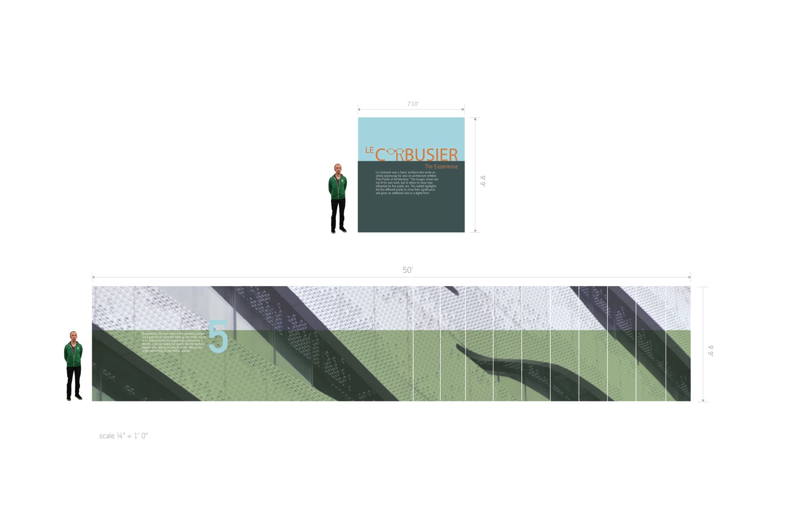
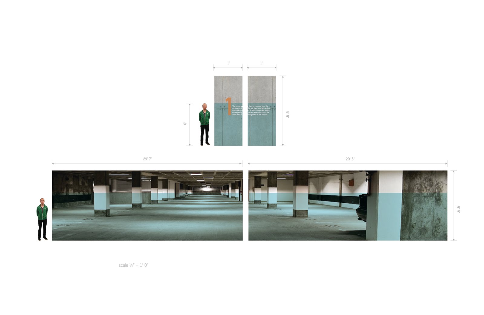
 Welcome to the Experience. The logotype was created from an iconic image of the man himself, using his glasses. “The Experience” was chosen as the title because it is all about the adventure of the 5 points of architecture. Within the Experience, the images shown are not of his own work, but of others to show how influential his five points are. This exhibit highlights the five different points to show their significance and gives an additional view in a digital form. The style of the Experience is proven to have inviting colors and typography explaining what they are seeing to then reinforce the space with several images in the real world. The image treatment is to have a multiplies bar of color that is close to the 6 foot person, which allows the the viewer to easily read the descriptions. Having the complimenting colors, like orange and green, allows for the number to stand out to viewer upon accessing the application on the itouch or iphone.


No comments:
Post a Comment