

Monday, September 7, 2009
Type: Minion Mailer Update!
Here is an update for my inside of my mailer. So far I think it is better than before, but still have some work to make the type face shine even more. The idea of the older paper as the image was to give the illusion of being back in the Renaissance. Then by that I came to a conclusion to use brown, orange, and green will be my main colors to exert keywords or want to point out a theme. The main theme will be on the opening parts of the mailer that I'll be working on next and will soon enough be up.


Friday, September 4, 2009
Vis. Lang: Matix UP close and personal
So for the past week some of the things I've been thinking of is the bass......not a fish or the music coming from car or home theater, but an actual upright bass. I came up with some ideas for the bass like for my puns one of them I did use speakers for a little underlying information about my artist, Christian McBride, since he does play electric bass too.

I am refining this idea more, so maybe it might get used. We will see. Another idea was using the bass clef for a main aspect of the bass being played in that manner as well as typographic relevance.

Another idea I had that was a pun was using the tool of classical training of time as the basic idea of a bass too. The swinging arm that either goes faster or slower by the weight resembles as a bow that is used to play a bass.

For some reason I wanted to show my music knowledge of using a rest and a repeat symbol that is used in writing music as a way to show an abstract form of the handle.


I also played on the form of the outer body of the bass too that can play with typographic form to give a simile. And also a parody of the crayon to announce the groups music cd 'Kind of Brown', it also might draw in more of the older youth to come and listen to music.


I am refining this idea more, so maybe it might get used. We will see. Another idea was using the bass clef for a main aspect of the bass being played in that manner as well as typographic relevance.

Another idea I had that was a pun was using the tool of classical training of time as the basic idea of a bass too. The swinging arm that either goes faster or slower by the weight resembles as a bow that is used to play a bass.

For some reason I wanted to show my music knowledge of using a rest and a repeat symbol that is used in writing music as a way to show an abstract form of the handle.


I also played on the form of the outer body of the bass too that can play with typographic form to give a simile. And also a parody of the crayon to announce the groups music cd 'Kind of Brown', it also might draw in more of the older youth to come and listen to music.


Wednesday, September 2, 2009
Type: Process
So for the inside I'm for sure changing because I think it has too much color in it and the white breaks the ares better. I still like my idea and it will hopefully read well in the end. I also might change the colors since these colors are to much like the 70s/80s.

The outer part I think so far is working to the point that the empty white space is making the composition more interesting. We will see what changes throughout.


The outer part I think so far is working to the point that the empty white space is making the composition more interesting. We will see what changes throughout.


Narrative in Sound: Project one refinements and changes
So I decided to change my topic since I find painting a picture more interesting to do for a whole semester, but also because it will be one way that I can relax and yet get work done for class as well as my brother. I've decided to keep the theme of animals to be the main images on the canvas because since I'm doing this for my brother and his wife, I wanted to keep to the theme of their baby's room. Hopefully this decision will be a good one since I'm more interested in it.
1st person painting a picture

3rd person painting a picture

Key moment in markers

Key moment in India ink
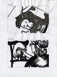
1st person painting a picture

3rd person painting a picture

Key moment in markers

Key moment in India ink

Sunday, August 30, 2009
Vis. Lang: Find + Share
images are from FFFFOUND
A interesting image: I consider this image to be hyperbole since this president (unknown) is big enough to hold the Earth and an airplane, as well as, allegory to the reference of political views. Also possibly antithesis for the freedom above and the controlled area below.

Apple of the World:
I would consider it to be antithesis because it has a contrasting idea in education and the map of the world, but it isn't necessarily differences. It also could be a pun? maybe.

A interesting image: I consider this image to be hyperbole since this president (unknown) is big enough to hold the Earth and an airplane, as well as, allegory to the reference of political views. Also possibly antithesis for the freedom above and the controlled area below.

Apple of the World:
I would consider it to be antithesis because it has a contrasting idea in education and the map of the world, but it isn't necessarily differences. It also could be a pun? maybe.

Saturday, August 29, 2009
Vis. Lang: Part One: Tropes+ Signs= Concepts

Semiotics taken from the Mind Map:
Icon: bass, jazz museum, Philadelphia, big apple (NY), Grammy, travel, acoustic
Index: time, rhythm (toe-tapping), fusion, funk, smooth, microphone, melody, composer, writer, notes
Symbol: innovative, award, warmth, loose, traditional, fresh, rain, bond, his father and uncle
Friday, August 28, 2009
Type: Minion
Minion
-designed by Robert Slimbach in 1990 for the AdobeSystems
-name comes from traditional naming system for type sizes (between nonpareil and breviry)
-inspired by late Renaissance-era
-inspired by classical, old style typefaces, a period of elegant, beautiful, and highly readable type designs
-combines the aesthetic and functional qualities that make text type highly readable with versatility of OpenType digital technology, yielding unprecedented flexibility and typographic control, whether for lengthy text or display settings
-the font family contains 3 weights and 2 widths, each with optical size variants, supporting full range of Western languages
-with many ligatures, small caps, old style figures, swashes, and other added glyphs, Minion Pro is ideal for uses ranging from limited edition books to newsletters to packaging

-designed by Robert Slimbach in 1990 for the AdobeSystems
-name comes from traditional naming system for type sizes (between nonpareil and breviry)
-inspired by late Renaissance-era
-inspired by classical, old style typefaces, a period of elegant, beautiful, and highly readable type designs
-combines the aesthetic and functional qualities that make text type highly readable with versatility of OpenType digital technology, yielding unprecedented flexibility and typographic control, whether for lengthy text or display settings
-the font family contains 3 weights and 2 widths, each with optical size variants, supporting full range of Western languages
-with many ligatures, small caps, old style figures, swashes, and other added glyphs, Minion Pro is ideal for uses ranging from limited edition books to newsletters to packaging

Thursday, August 27, 2009
Narrative in Sound: Storyboards/ Sketches
First person story board

3rd Person story board

Key Moment of the girl putting on her shoe

Key Moment of actually running

Key Moment of stretching


3rd Person story board

Key Moment of the girl putting on her shoe

Key Moment of actually running

Key Moment of stretching

Vis. Lang: Jazz Research
So in jazz of the 80s, the music came up with a development of acid jazz, which blended jazz influences into funk and hiphop. Acid jazz is particularly looped beats in the music. In the late 80s that is when nu jazz(influenced by jazz harmony and melodies, as well as no improvisational aspects) and jazz rap(fused jazz and hip-hop) brought in another fused jazz part. In 2000s straight ahead jazz (keeping the traditional form of the jazz music and can be contrasted with smooth jazz) appeals to a core group of listeners into today.
Christian McBride
Christian McBride was born in 1972, where his mentors were his father, Lee Smith, and great uncle, Howard Cooper who are well known for playing bass. In the jazz community Christian is considers to be one of the best bassist of his generation. He had classical studies at Julliard. He primarily plays upright bass but can play electric bass equally well. He is one of the most important and original American musicians to the point he got a Grammy award-winning as being virtuoso of bass.
Christian is a composer as well as an arranger. He has over 200 recordings and has backed up artists from McCoy Tyner and Sting to Kathleem Battle and Diana Krall. When he isn't playing he is the spokeperson for the music. In 1997, he spoke of former President Clinton's town hall meeting for "Racism in the Performing Arts."
Since then Christian is the Co-Director of the National Jazz Museum at Harlem. He is playing within a quintet that he put together and is called "Christian McBride and Inside Straight." The band members include Eric Reed(pianist), Steve Wilson(sax.), Carl Allen(drummer), Warren Wolf(vibraphonist).
Christian McBride
Christian McBride was born in 1972, where his mentors were his father, Lee Smith, and great uncle, Howard Cooper who are well known for playing bass. In the jazz community Christian is considers to be one of the best bassist of his generation. He had classical studies at Julliard. He primarily plays upright bass but can play electric bass equally well. He is one of the most important and original American musicians to the point he got a Grammy award-winning as being virtuoso of bass.
Christian is a composer as well as an arranger. He has over 200 recordings and has backed up artists from McCoy Tyner and Sting to Kathleem Battle and Diana Krall. When he isn't playing he is the spokeperson for the music. In 1997, he spoke of former President Clinton's town hall meeting for "Racism in the Performing Arts."
Since then Christian is the Co-Director of the National Jazz Museum at Harlem. He is playing within a quintet that he put together and is called "Christian McBride and Inside Straight." The band members include Eric Reed(pianist), Steve Wilson(sax.), Carl Allen(drummer), Warren Wolf(vibraphonist).
Wednesday, August 26, 2009
Narrative in Sound: Narrowed Down Idea Choosen
So in the end of making a list and comparing my options I had at the beginning, my decision to do it Running/ working out. Some of the reasons of pointing this one out more was the different ways of interpreting the hobby/sport by either position of the hair straight down to the movement in the space. So now I will begin to draw up more ideas to go with it.
Vis. Lang: Jazz Visual Inspiration

And this is Christian McBride himself. And I choose the one with him standing next to his bass as a sign of devotion he has to his instrument. Also the color helped give a mood too.

These colors I choose were for the warmth that I get while listening to the music as well as brings the energy of the music too.

With this inspiration, I was looking for rhythm, and movement since Christain McBride's music has a fast pace feel to it and is playful. The reason why I choose rain as inspiration was by thinking how every time rain hits a window it has a beat to it if you listen close enough and separate the sounds. Lines are also to demonstrate how fast and how far apart some notes are from each other.
The text I think that would work for the music that Christian McBride & Inside Straight would relate to would be either Universe or Grotesque condensed sense it can have an open feeling and also bring a cleanness to a page but for the smaller text I might use a sans serif.
Narrative in Sound: Ideas for Project 1
Here are some of my ideas for project one that I think have a good possibility.
-grocery shopping*
-running/ working out*
-ordering food
-picking out an outfit
-making a bed
-brushing/ flossing teeth*
-playing w/a dog
-painting a picture
*the ones I will go further on to then narrow down to one
-grocery shopping*
-running/ working out*
-ordering food
-picking out an outfit
-making a bed
-brushing/ flossing teeth*
-playing w/a dog
-painting a picture
*the ones I will go further on to then narrow down to one
Tuesday, August 25, 2009
Type: The Gutenberg Press
Throughout the film, I realized that no matter what I was thinking during the film Gutenburg became an engineer, a merchant, and a intelligent man to invent the press that started mass production. With his invention, manuscripts would slowly disappear and put ease to those who wrote for the manuscripts for a living. The outcome of his invention gave the availability to those that would want to read the Bible, but the downfall to those who couldn't afford the book, they were more likely not to go to church.
The most fascinating thing about Gutenburg was remaking his press now would become a journey to those who would build it. This also brought that supposedly Gutenburg kept close to the water because he was playing with fire since him and his workers made the letter forms. Just watching how they would have made each letter was fascinating in itself by just how the mold that held the form then left an empty space to pour metal in for the outcome of the letter. The process was mind-bottling that I watched that scene a couple of times to figure how it worked.
The most fascinating thing about Gutenburg was remaking his press now would become a journey to those who would build it. This also brought that supposedly Gutenburg kept close to the water because he was playing with fire since him and his workers made the letter forms. Just watching how they would have made each letter was fascinating in itself by just how the mold that held the form then left an empty space to pour metal in for the outcome of the letter. The process was mind-bottling that I watched that scene a couple of times to figure how it worked.
Monday, May 4, 2009
little process

 For the texture look, I printed off my icon pattern and dirty it up a bit, scanned it back in, cleaned it up, and put the image behind my color icon patterns to give them a texture. This process has shown up many times through out my entire semester. Overall my design towards my icons have progress to a higher meaning now with the texture among them. I'm thinking I might have another set of icons with texture among the single icon to give another meaning. But I don't know exactly if I will, if it is a good idea I would like to hear about it.
My 50 words or so....
First working in multiple layers of ideas helped get a good theme of the worn down look among the many creations. With this process through this project, I learned how to keep a unity along all processes that are engaging and visually clear representing the theme through the different stages.
Subscribe to:
Posts (Atom)