Showing posts with label Info Arch. Show all posts

Wednesday, May 5, 2010

Info Arch: Process

Before I had did some changes, I had a red/black stripes as my background which gave a myspace feeling, even though most of the backgrounds I have tired haven't met my standards of how TOOL feels when played.

When looking at what I have here, I wanted to keep the spot light feel when an item is clicked to represent the stage feel.

I know that my layout is very clean compared to how TOOL plays, but I thought it would be a nice contrast.


So far with the revisions, I was able to find a concert photo from TOOL with the lights, but I'm still getting the same feeling as before...What am I going to do? I guess keep looking. I changed my sorting buttons into rectangle boxes instead of the pill shape, as well as added another scroll indicator so it is more clear where you are at when scrolling.

One of the things I'm still working on is making my icons have white within instead of letting the color come through, which has be problematic, but will be solved. I'm also trying to figure a good color that would give enough contrast to the icons so they stand out, instead of the off white.

More to come ASAP.
A little better I believe, but trying to figure what is a good color for the background for the info-graphs.


I think I finally figured it out

Tuesday, April 20, 2010

Info Arch: Final Direction


I still have quiet a way too go with getting my images the way I want them to look, but I'm happy that EP reminded me that I do have the background of site to design too not just the main contained part. This eye opener gave me a bit more space to work with and explore. I still feel like that keeping the photograph images at three quarter view will help make the site a bit more cleaner, but we shall see.

Thursday, April 15, 2010

Info Arch: Iterations on Macro/Micro

These are just ideas of what I could do with layout and background.

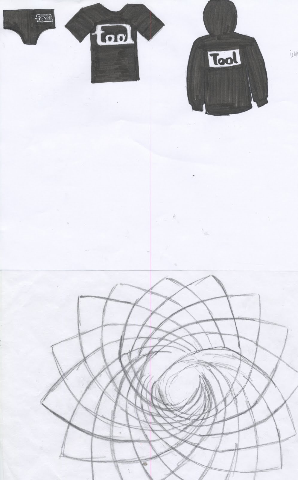
The idea of this first one was to show the sorting view with the multiple items in my collection in a pile at different sizes to represent a start to an end. The sketches on the left will be click-able to view a graph or other important information.

Idea two has to deal with the shirts ideally worn, but with no limbs in photo to give dimension, and be represented by size as well but in a cleaner look. I might even try this where they are in grid base and show size that way.

Idea 3 was with the ability to scroll left or right to see the change, but I also would might having the small sketches do the same and have a scroller to show where you are at when previewing the photographed images.

Wednesday, April 14, 2010

Info Arch: Iterations

So my iterations are based off the 3 areas of folded, unfolded, and logotype. Some of the areas I still want to explore the illustrations that Alex Gray did and simplify them.


Wednesday, April 7, 2010

Info Arch: Information Graphs Sketches

So before I started my sketches, I did a brainstorm of about 20 ideas that I could possibly do an informational graph. here is my list of ideas:
1. Top 10 t-shirt man. in US
2. Tour dates
3. How many tickets sold during certain tour dates
4. When they were bought
5. How they are manufactured
6. Progression of logotype changing
7. How much shirts were then to now
8. How much concert shirts usually cost compared to store bought
9. Geographic bio of artists
10.Time to set up stage/break down stage
11. The different instruments throughout the years
12. Albums sold for each CD
13. Comparison of all the tour places
14. Concert survival kit
15. Tool CD date of come outs
16. Alex Grays work throughout Tool
17. Something with the music videos
18. Different retailers distributed
19. The different type of people that would go to TOOL Concert
20. Chart records
21. Length of CD
22. How shirts can be made

From there I choose 9 of these ideas and sketched out what I thought is a good range for infographics. After doing these I feel I could take some different approaches to each of these to represent the idea better now that these have been done. I did want to do the different type of people that would go see see TOOL in concert, but I felt like I didn't have an idea of where to start as to representations like clothes, or having a full image of a person, or breakdown of what they could wear, but I'm thinking and it might come out soon.

1. Top 10 T-shirt manufacturers in the world
2. How the logotype changes over time

3. How many albums were sold in the first week of being out
4. What I bought and when
5.Length of Playtime on CDs
6. Geographical Bio of the original 4 artists of TOOL by where they were born
7.How Distribution Works
8. How to make a silk screen shirt
9. Concert Survival kit

Friday, April 2, 2010

Info Arch: Classifaction system of TOOL Ephemera

Here are some ways of organizing my collection of TOOL Ephemera.

1. Year and Logotype and how it changed through time
2. color by percentage of black, white, gray, and other colors
3. image on back, front, side, or both
4. where I got them
5. size

Thursday, March 4, 2010

Info. Arch.: Design from Wed.

So here is the main page of what you would scroll down on the main page. This idea is a cleaner look at looking all four areas that I'm presenting. Some of the changes I need to work on:

-the background timeline needs some much needed work
-take out the extra timeline of additive information to make everything else clearer
-add more images for the thumbnails
-add some full images to the readings so there is a nice break
-work on fixing the type within the articles (ie spelling, extra blurbs, make it more interesting)
-fix the hyphen or fix post modernism to look like modernism
-fix the pop up windows for images so that they are a fixed object
-add the back to top arrow too....(DON'T FORGET :) )

Overall I have come a long ways from where I was before, and I like the simplicity of how the color interacts as a whole.

Thursday, February 25, 2010

Info. Arch.: Working.....

So after having multiple critiques end badly, I really feel like I am behind. I felt like I needed to figure out the functionally first before doing the major major design that I like to do, but I guess I need to take a step back and design something I like and work from there. So far right now I feel like what I have here reminds me of a old school museum like website just by the colors. I have tried pastels, and these colors and I don't think bright bright colors would work either. I will post the old versions with the pastel colors asap, so keep a look out. SO much to do in SO little TIME.

Tuesday, February 23, 2010

Info. Arch.: From Presentation

Sorry for the delay, but here are my three approaches, and while thinking it over I have going to look at approach 1 and 3 to refine even further.

Approach number 1: dealing with sliding out time lines that present a reading. The time lines also have stripes that reveal information like a photo or important information.


Approach number 2: Has the same concept as the first one but instead of opening up the time line to reveal the more information, this approach gives the person the choice to choose between the two designers and still look through the time line. This approach however does lack the ability to let the viewer read about modernism and post modernism in depth.

Approach number 3: With the idea of Katherine McCoy's understanding communication, I played with her idea of how all four connect in some way. The viewer is able to click on any on the titles to get the readings and images will reveal through out. This approach needs some major revisions to get where it would be interactive more.

I was thinking if I do revise this one I could have images in the background in which when clicked on the subject they would become highlighted, and while they are highlight then the user could click on them to in large and read what they are. A lot of work here to do.