For the beginning, I started with simply the two letter forms T and R for Type Revolution and using my experiments as the base to turn them into a logotype. One of the things I have realized with this part is that I should have started with the exact size I want to use them because resizing wouldn' t be true the form. When I place this onto artifacts I plan on having Type Revolution placed underneath even though I could figure at more places to had it.
One of the other things I was working with for my logotype was taking the whole words for my conference and applying the pattern to it, this idea can make many logotypes with different grids as their base.
Another way I tried was having a simple grid with the letters in their own square, which I am still playing with.
Overall I'm expanding on these ideas.

I wanted to see what my full length logotype with m experiment applied to it would look like on an artifact, so I attempted the name tag. With the name tag I placed a grid in the background and took bits and pieces away from it, so it might add personality. From there when I add the name, organization, and place, I had them contained using the grid as the container and using my rule of where it touch it got filled, but I kept the important part readable.


 Take three will consist of changing of size of imagery and where text needs to be more important than image.


 With the website I was still having the reflection of the name tags, but in a different way. I kept the negative space within the grid to give depth. I did add more of a gridded structure to how I approached the navigation and way you would read the website, also choose to use two different typefaces to give some areas more hierarchy. One of the things I wanted to achieve was when you clicked on a new page the background grid would be the thing that changes and the navigation bar expands across, so you would know what page you had clicked on.

 Within the inside of the notebook, I have the similarity of nametags within. I also just have a placeholder in here to show where the notebook paper will go, but the page is lighter in person.
 With the nametags, I decided to add a color background to add a break from seeing grids everywhere, but also to use to the white space of the back. With the purple and yellow nametag, I tried to change the hue of the yellow so the text could be white, but it just wasn't working so using a light purple gave more legibility.


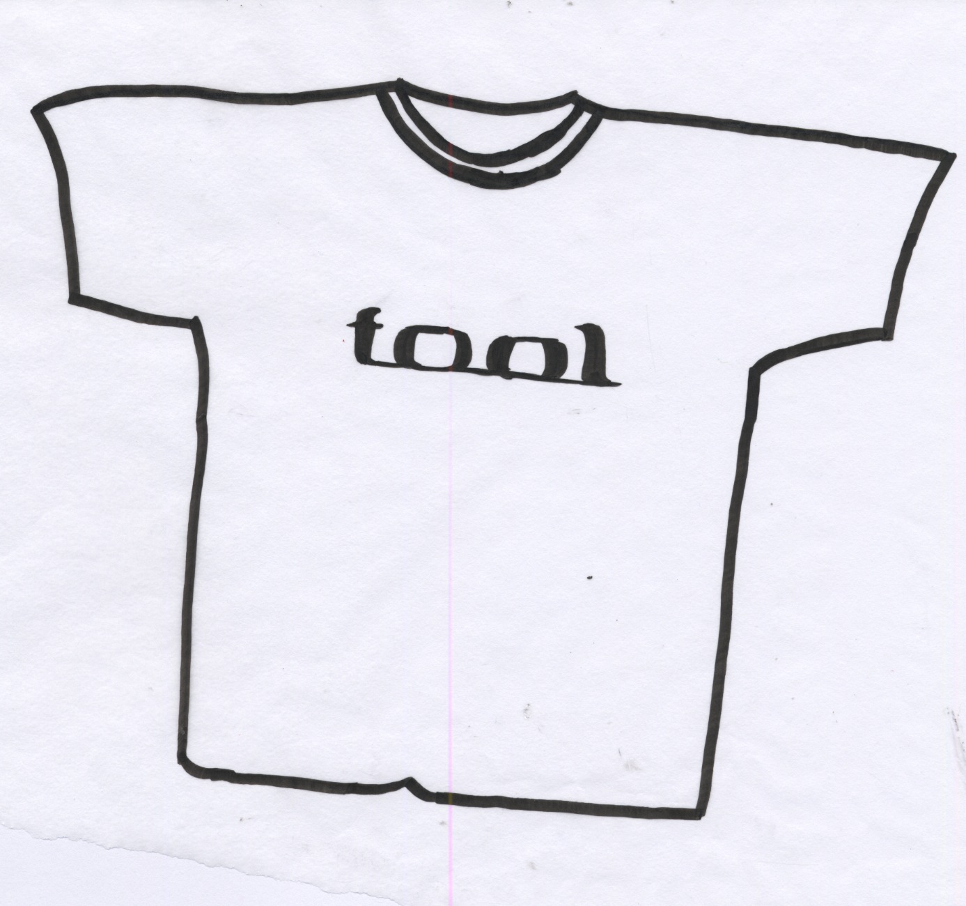
 Idea two has to deal with the shirts ideally worn, but with no limbs in photo to give dimension, and be represented by size as well but in a cleaner look. I might even try this where they are in grid base and show size that way.
 Idea 3 was with the ability to scroll left or right to see the change, but I also would might having the small sketches do the same and have a scroller to show where you are at when previewing the photographed images.

 With the website, I was thinking of having the navigation bar be helpful on what you clicked upon. This is just one of my ideas, the other will be put up a little later.
 With the nametags, I decided to use complimentary colors to get a good contrast as well as grid to type. I have realized, I have some areas to solve with the purple and yellow, but it will get worked on. Otherwise the size of them are a decent size.